Walters Services Logo Rebrand
Deliverables:
1 Logo
This was my second professional logo project at Stoner Graphix. This project went on for several months and took on several different forms. Initially planned as a merging of companies, by the time I took on the task the companies had decided not to merge, but Walters Services still wanted to continue with updating the logo. I was tasked with using the final type that was decided and modernizing the logo so that the company would stay recognizable to its customers while bringing new life to its brand.
Process
When going into this rebrand for Walters Services, I was asked to keep the color scheme of the company fairly close to the original but bring in a new modern typeface that was previously approved. They also liked the idea of adding more flare to the look by using gradients and dynamics to the logo. Overall they wanted to keep a similar shape and vibe to their look so that their long-time customers would easily recognize the new look.
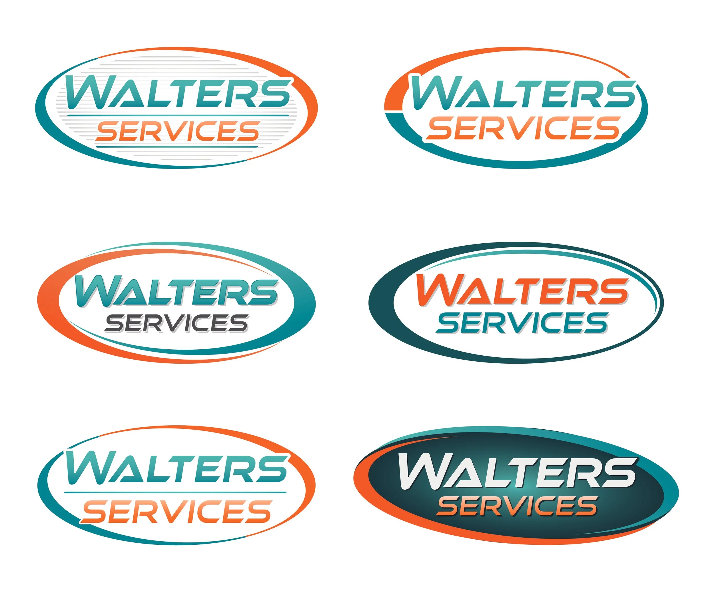
I tackled the project and worked on dozens of variations of the outside shape, how the color scheme works, and how I wanted to play with the features and flares that the company was looking for. I ended up with six key variations that went through a few more adjustments before finally landing on the final design.


Final Designs

