
Deliverables:
Logo
Website (Home Page, Sign-up/Subscription page, Records, About, Contact, and Cart)
Packaging for the standard membership option
Deluxe Box Packaging for the Premium membership option
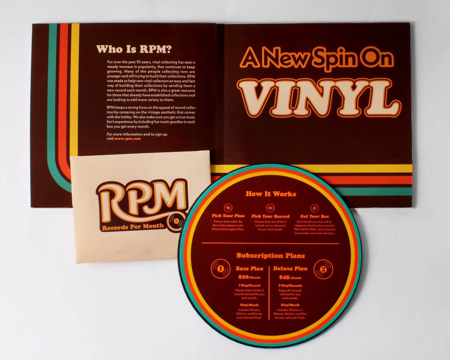
Vinyl Slipmat
Stickers
Pins
A Direct Mail advertising campaign
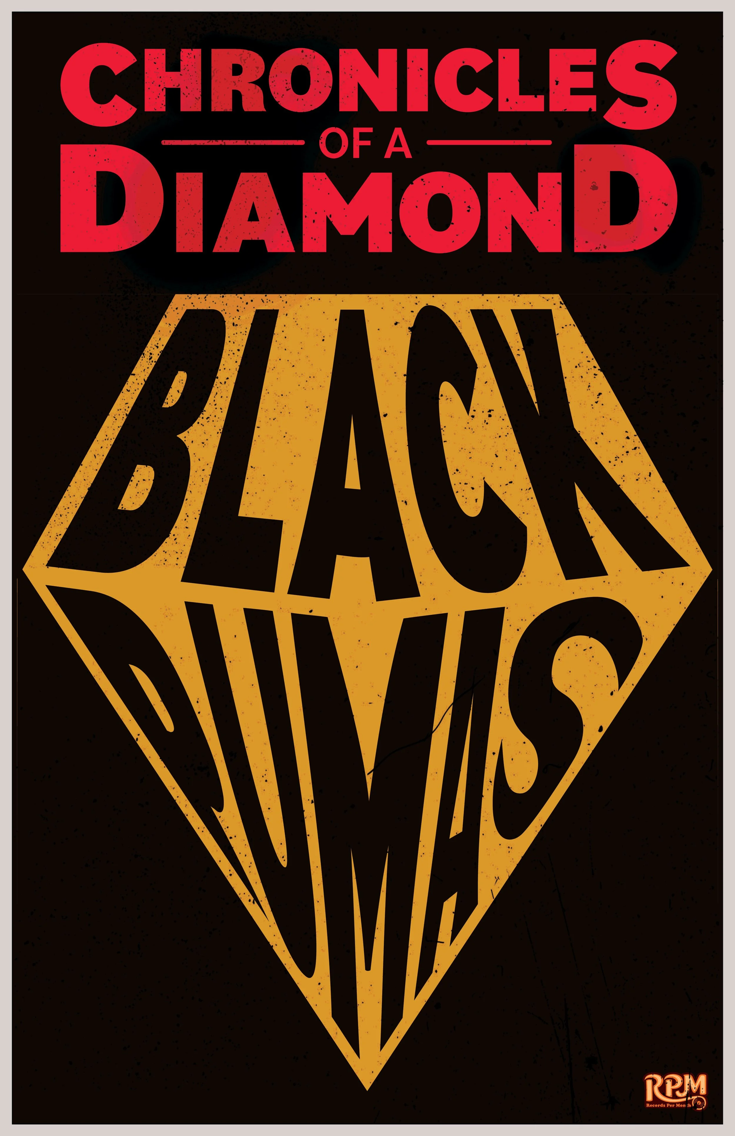
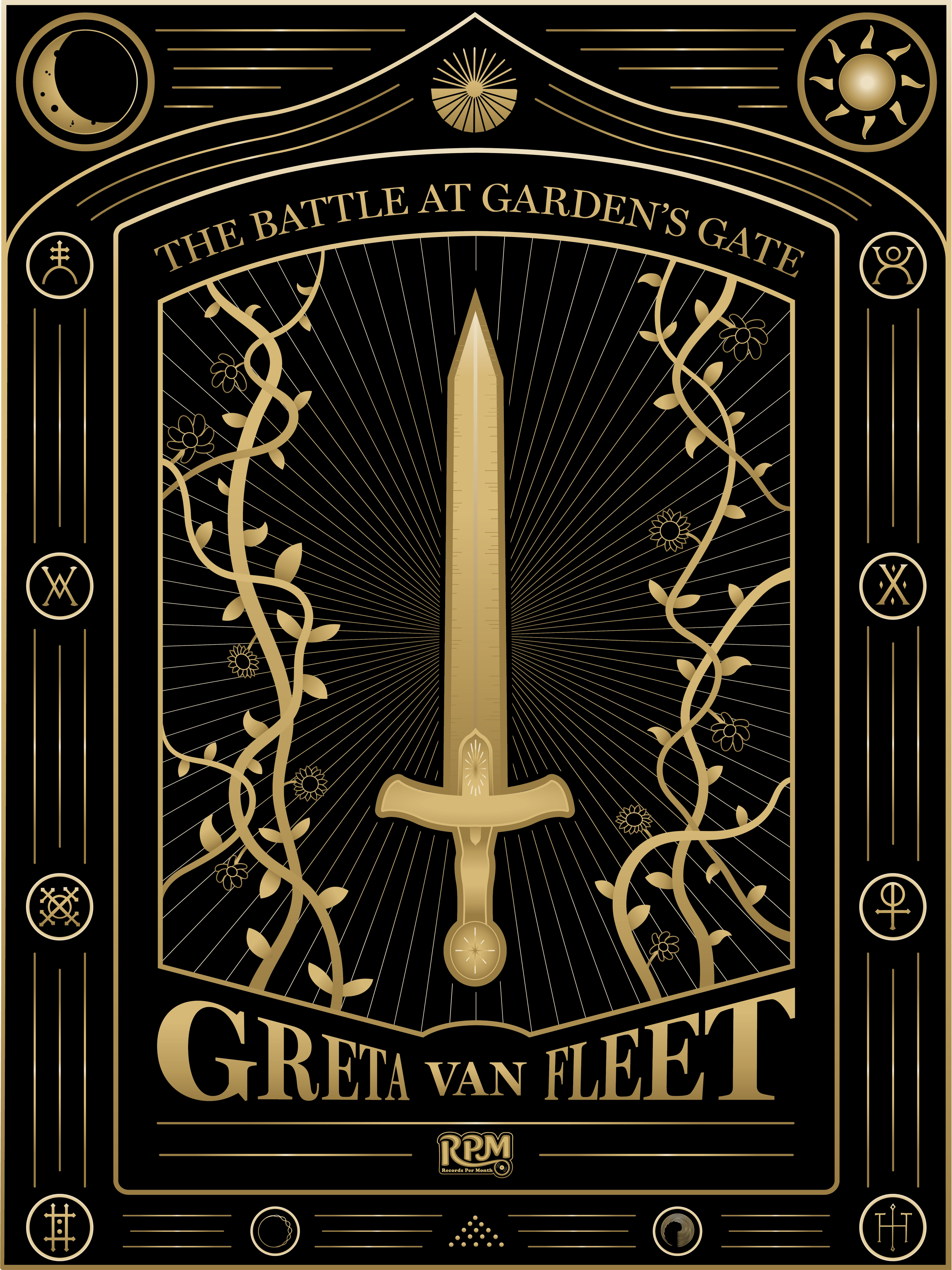
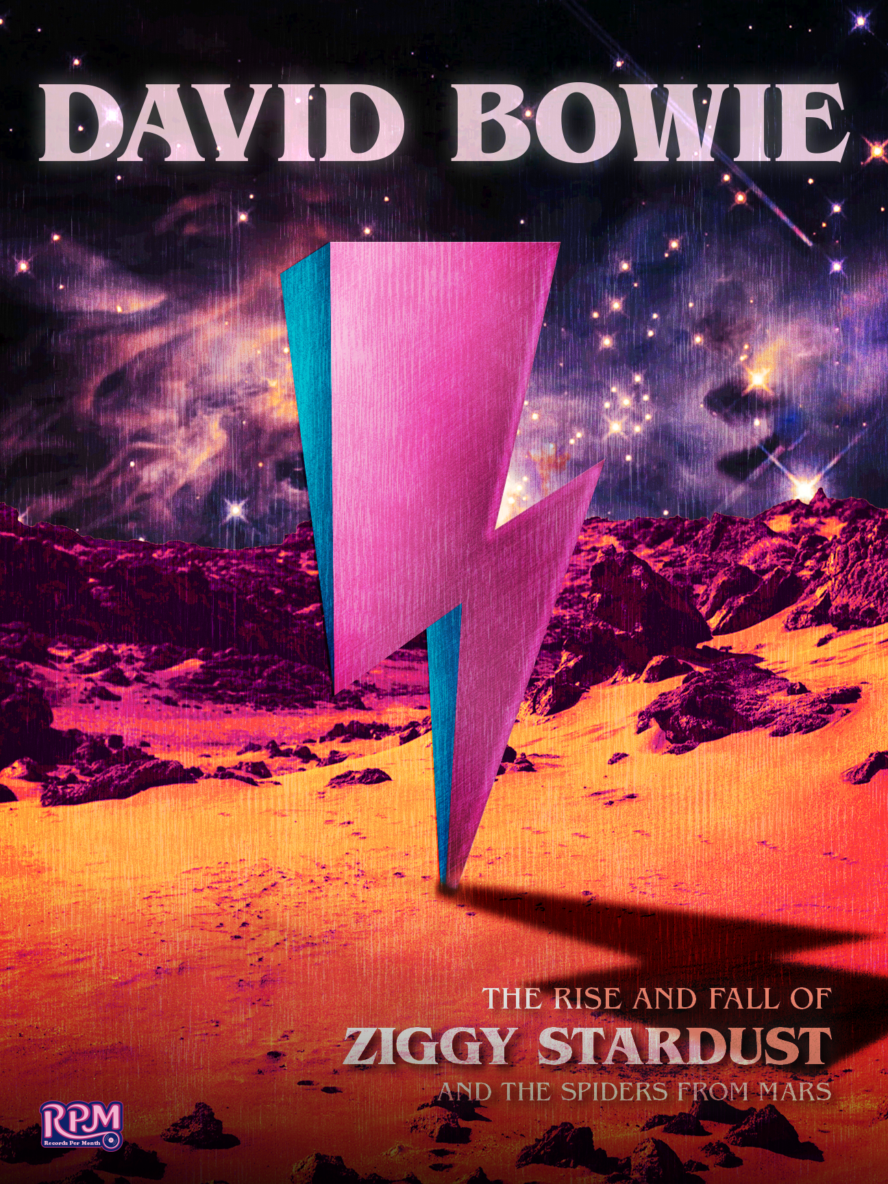
3 Posters
Objectives:
To independently research, design, and produce a logo, packaging, a website, a direct mail advertising campaign, three posters, a vinyl slipmat, and stickers and pins for a vinyl record subscription service.
To thoroughly research the components necessary for my brand as well as the style that I am planning on taking for the project and apply what I learn to my own concepts.
To develop a cohesive new brand design for all components of my design.
To apply previous knowledge of the fundamentals of design to the branding, illustration, typography, packaging, and layout of all components.
To apply the critique received from my peers and faculty to appropriately better design the components of my project.
To thoroughly analyze my own work and critique my designs throughout the process of this project to improve my work.
To professionally present my project and showcase its cohesive style across all deliverables.
To neatly assemble my project with very clean and professional craft.
About the Company:
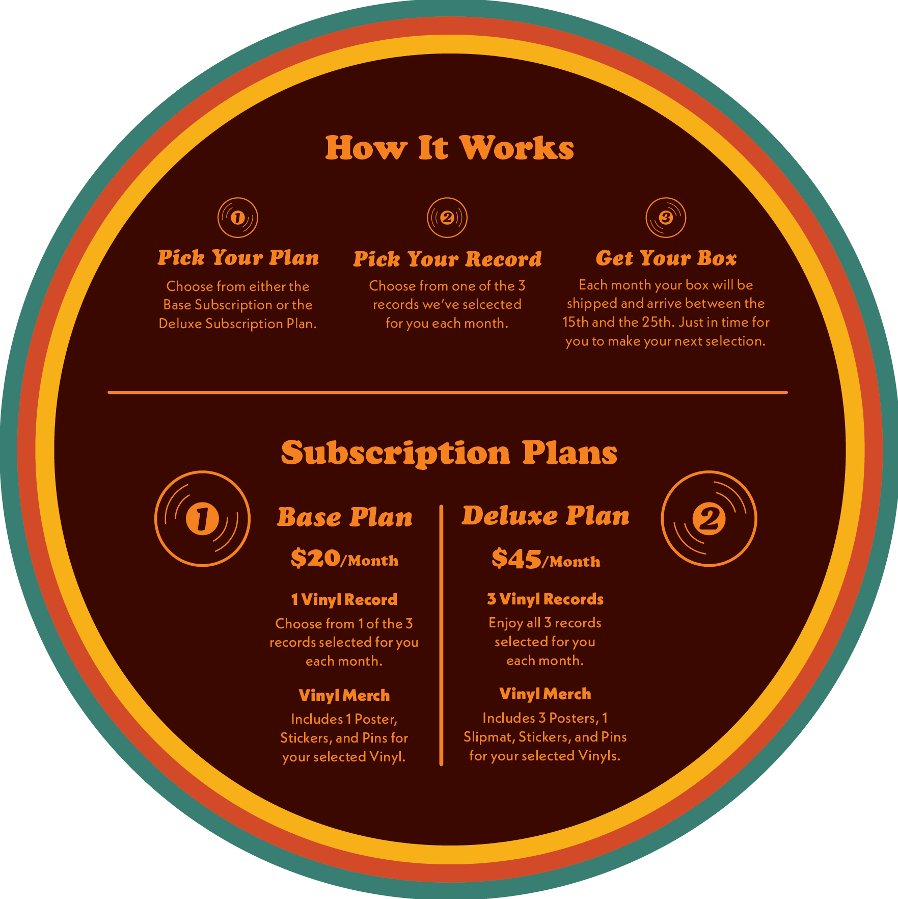
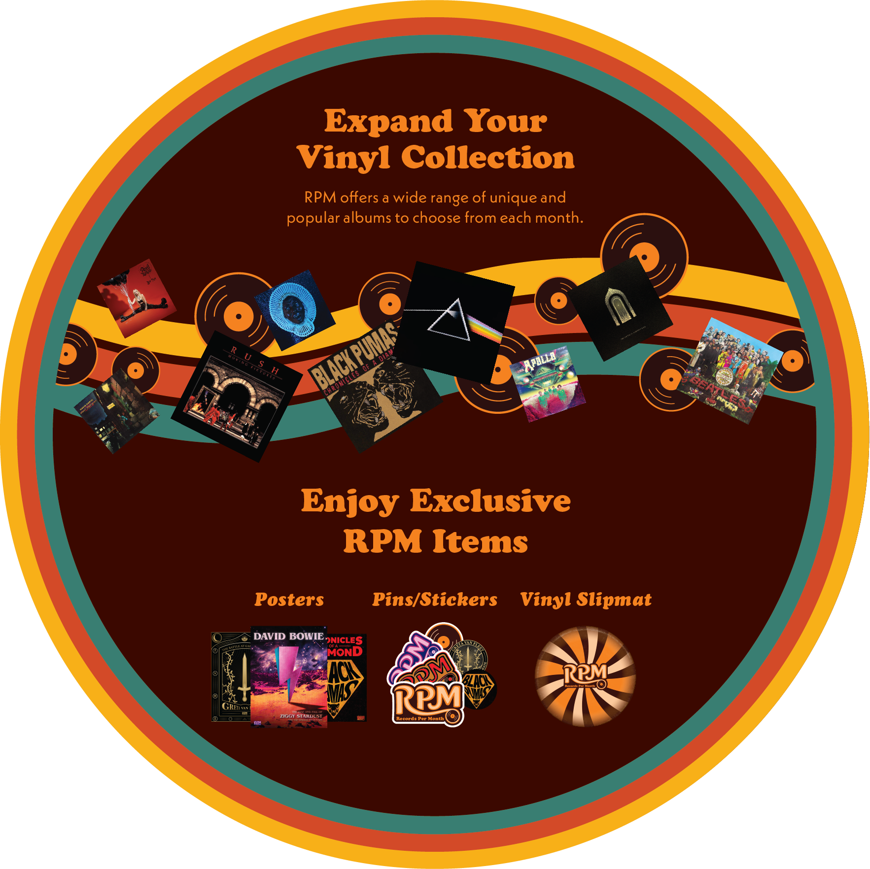
RPM is a newly established company looking to set itself apart from the competition by offering a more user-friendly experience that allows the customer to expand their record collection by giving them a variety of options to choose from each month. The subscription service works by giving the customer 1-3 record options per month where they will select one record that they want. When they receive the package it will include the selected record, as well as extra RPM exclusive items including posters, pins, and stickers. If the customer signs up for the Deluxe Subscription option, they will be able to select all three records and receive an extra number of RPM-exclusive items in their box each month, including a vinyl slipmat.
Project Scope:
To establish this new brand, RPM wants to stand out from the competition by taking inspiration from the history of music to create a lively, fun, and vibrant brand. The branding for this company will pull aesthetic inspiration from the 60s and 70s disco/soul style that will help create a fun feel that will make the customers feel like they are part of this music experience before they even open the box.
Target Audience:
RPM’s target audience is focused on the young adult and millennial demographic, mainly aiming for the ages of 20-35. A large number of record sales have been driven mainly by younger millennials and Gen-Z as they find the process of owning and listening to vinyl records to be nostalgic and offer a different way to listen to the music they love. This makes this demographic a good candidate to target more and apply that nostalgic quality to the RPM branding. There will be a strong focus on music lovers and those that are already collecting vinyl records, while still marketing to others in an effort to get them interested in starting their own collections.
Research Synopsis
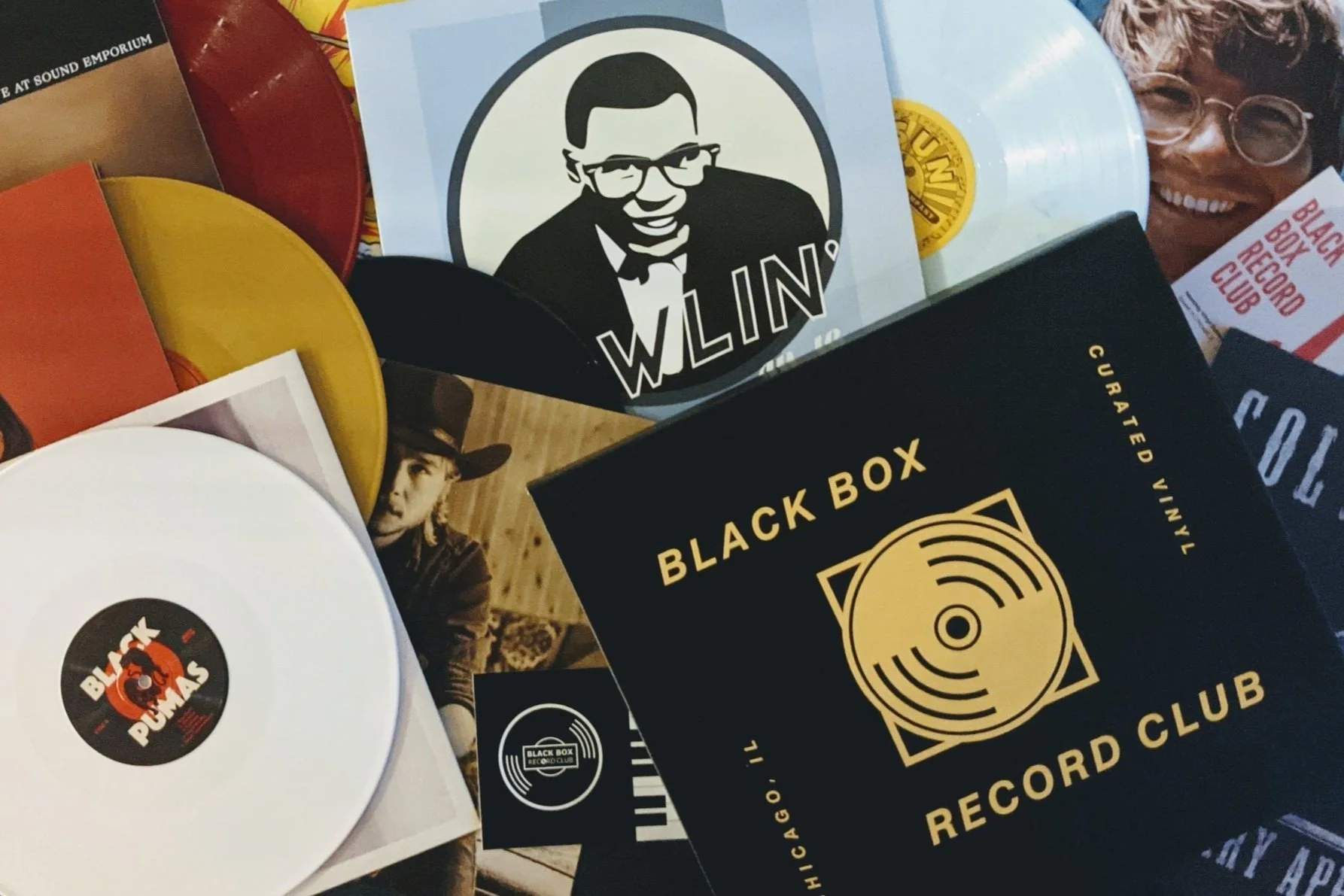
Before I began deciding what direction to take with my company, I first needed to start researching the competition and find what other companies were providing the same (or a similar) service to mine. My research mainly focused on their names, logos, style, packaging, websites, how their systems operated, and any extra content they included in their subscriptions. The main companies that I researched to get this information included: Vinyl Moon, VMP (Vinyl Me, Please), Black Box Record Club, Magnolia Record Store, and Book of the Month. Through my research I learned what I liked and didn’t like about their styles and systems, as well as what I thought worked and didn’t work.
After researching each of these companies, I determined that nearly all of the brands were not very exciting or fun and I found that there was an opportunity to design the brand with a style that contrast and stand out from the competition. I learned that most of the companies’ styles varied from feeling fairly boring to being very clean at best. But I felt that none of these brands were as exciting as they could be when they are marketing towards something like music, and I felt that I was able to tap into something that these brands were missing. This research inspired me to lean into designing towards a particular era from music history and find a style that was very different and would make RPM standout from the competitors.
After conducting this research to gain an inspiration from companies and what makes them stand out amongst each other, I took this research and combined it with my brand, mission, and goals for the company and composed a second mood board for design inspiration. I composed a moodboard that consisted of logos that are more flowy with more structured and grided designs. I lastly wanted colors that would stand out and designs that looked relatively different than you would typically see, especially on energy drink cans.

Once I determined that I wanted to focus on a particular genre, I decided that I wanted to research and take inspiration from the 60s/70s disco and soul movements. I felt this style would fit the fun and lively aesthetic I was looking for, and I felt that the style is easily recognizable and would help the audience quickly relate anything from RPM directly to music. To try and find exactly how I wanted to tackle this style I began conducting research into it and made a moodboard for it. I mainly pulled inspiration from things I saw on Pinterest and Designspirations, to help give me an idea as to what things were repeated throughout this style and how I could best apply the different aspects of the style to my brand. This moodboard also gave me a good idea as to where I should start when it came to type choices and colors that I would want to use.
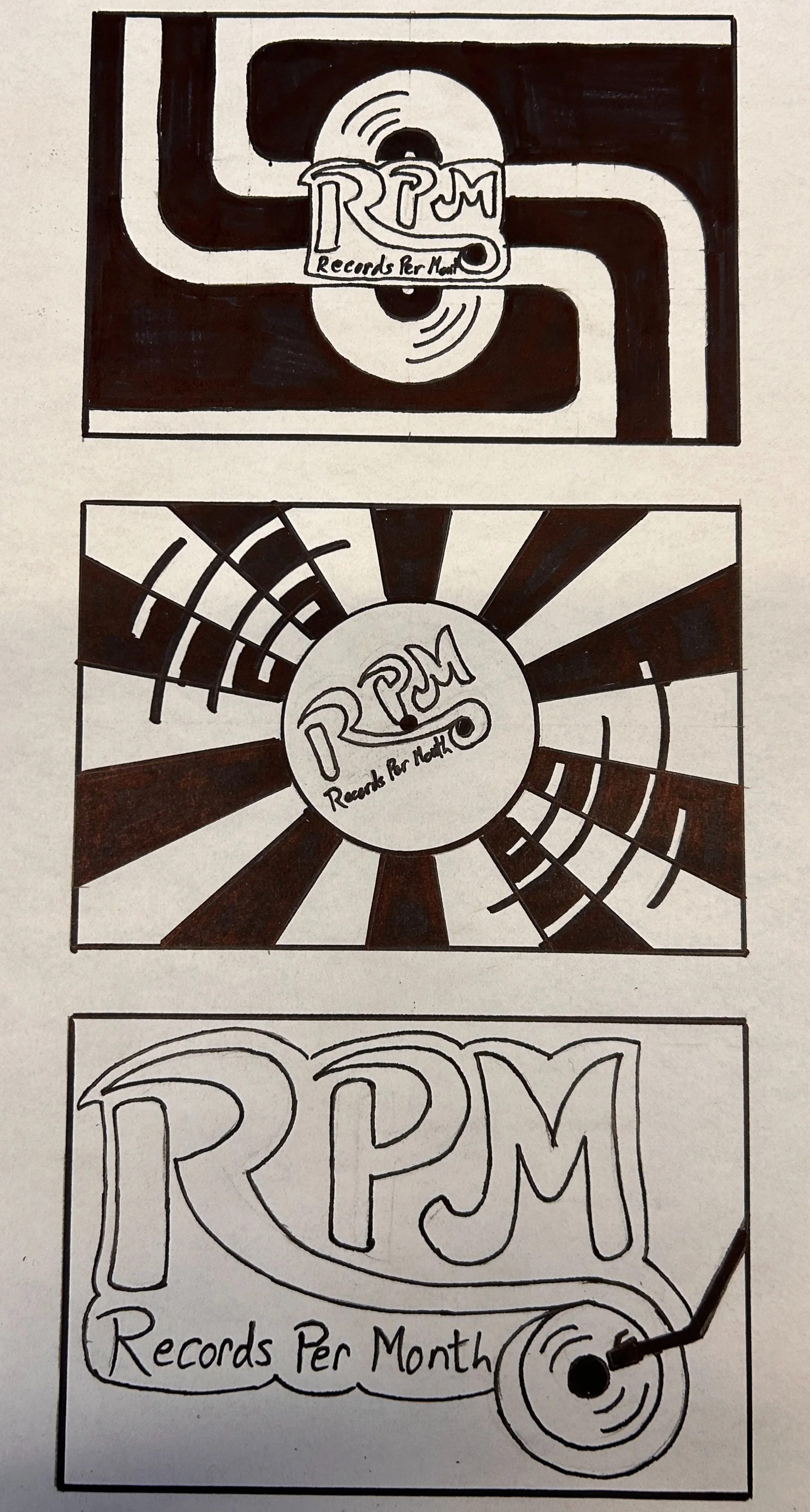
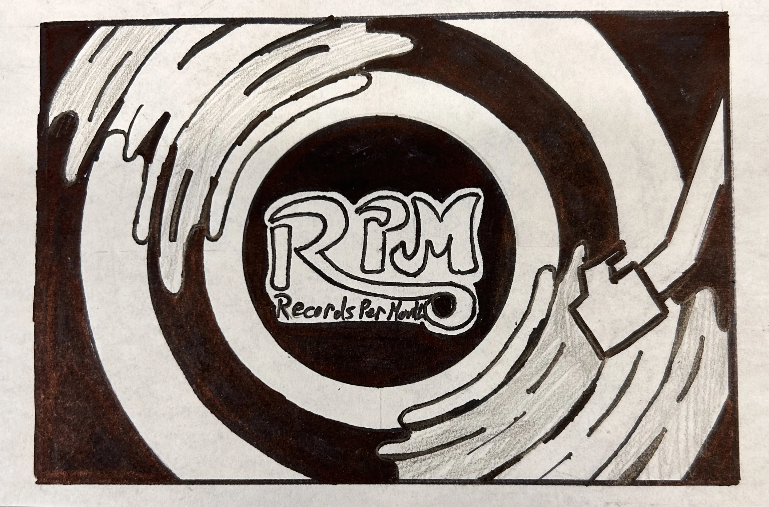
After I felt that I did enough research to get me started, I then began to tackle thumbnails for my logos.
Process Narrative
Logo:
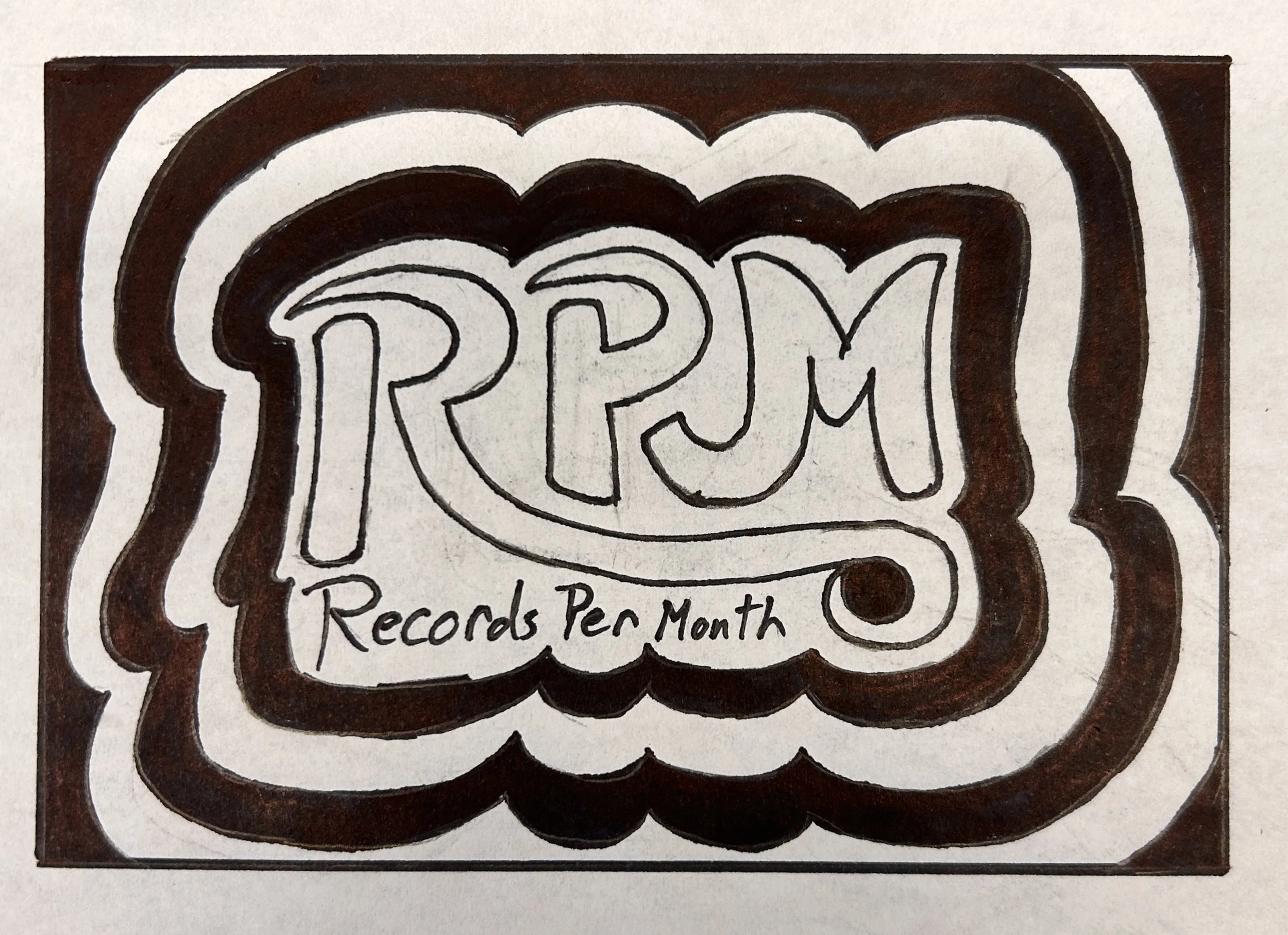
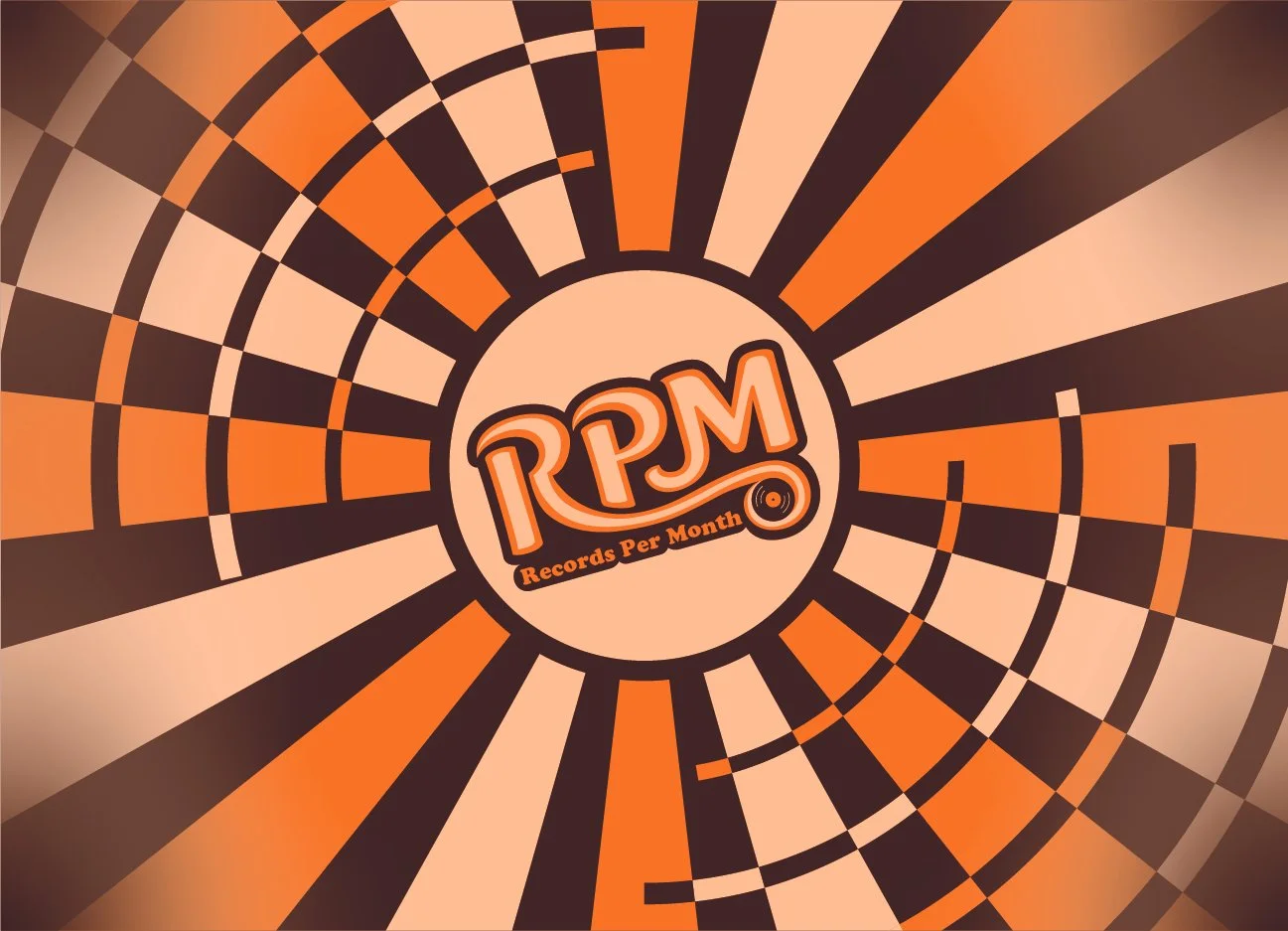
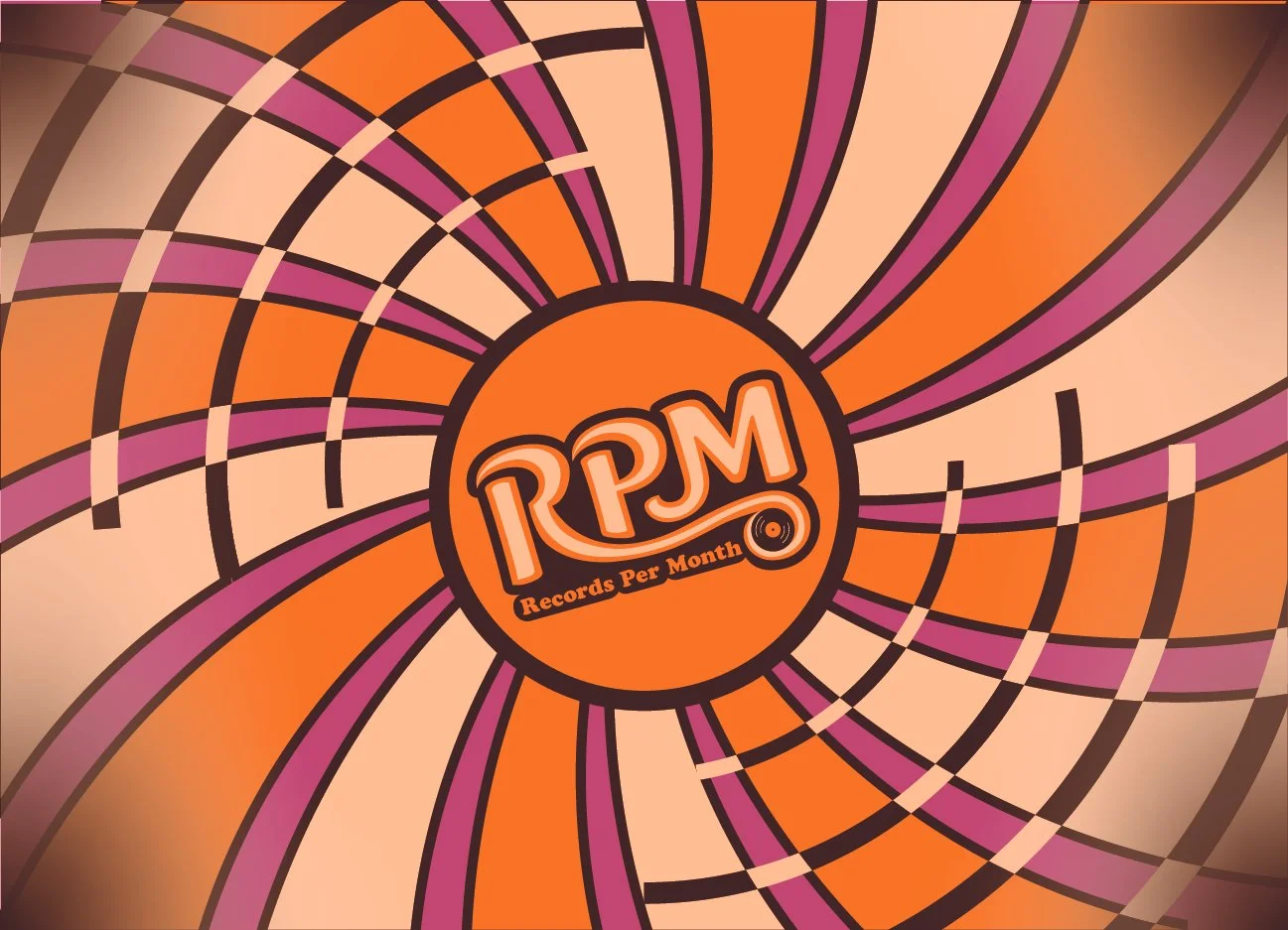
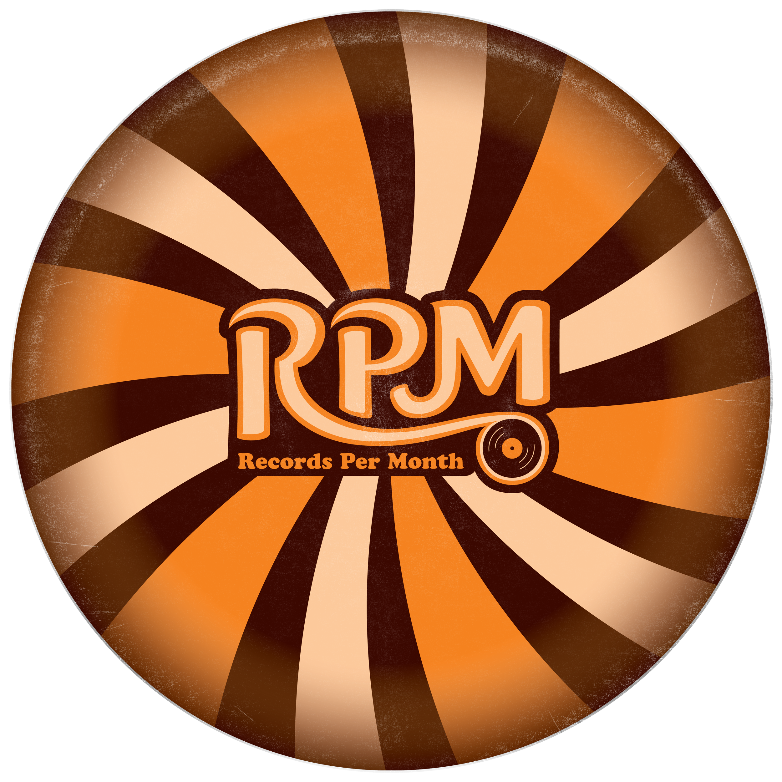
For my logos, I had already determined the style I was looking for and now it was a matter of applying it to the logos. I had noticed the different uses of line work and round edges in the disco style, so I tried to work that into several of my designs in the thumbnail stage. I eventually found that the second was my most successful and worth further processing on the computer. When I moved to the computer, I modeled my logo off the font “Ice Cream” which I had also initially used as the subdominant text in the logo, although I later changed that to “Cooper STD”. In the later iterations of the logo, I tried to refine the flow from the leg of the “R” into the record, played around with colors, and removed the drop shadow piece from the mark in favor of a cleaner outside container that helped to make the logo pop the way I wanted it to.


Packaging:
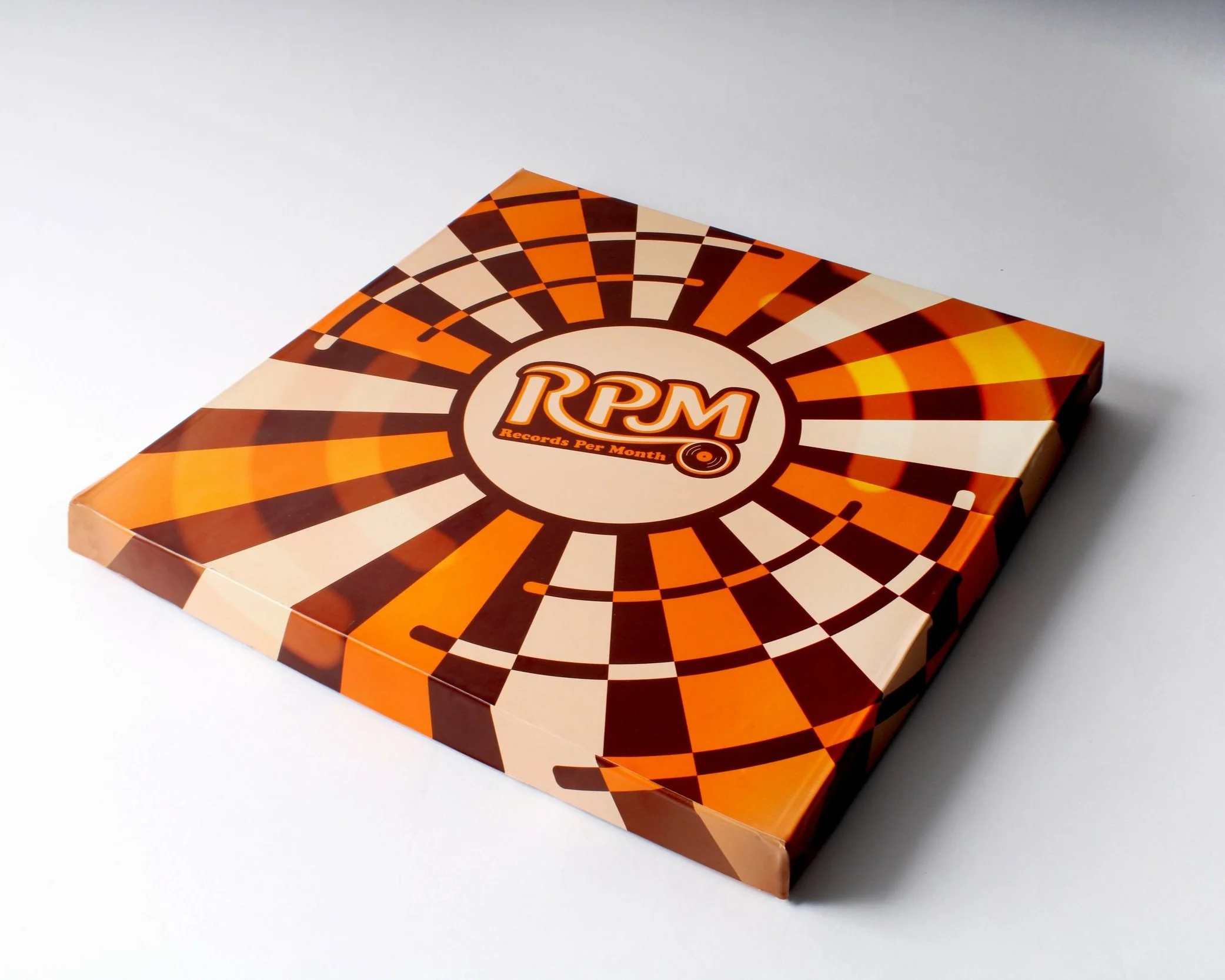
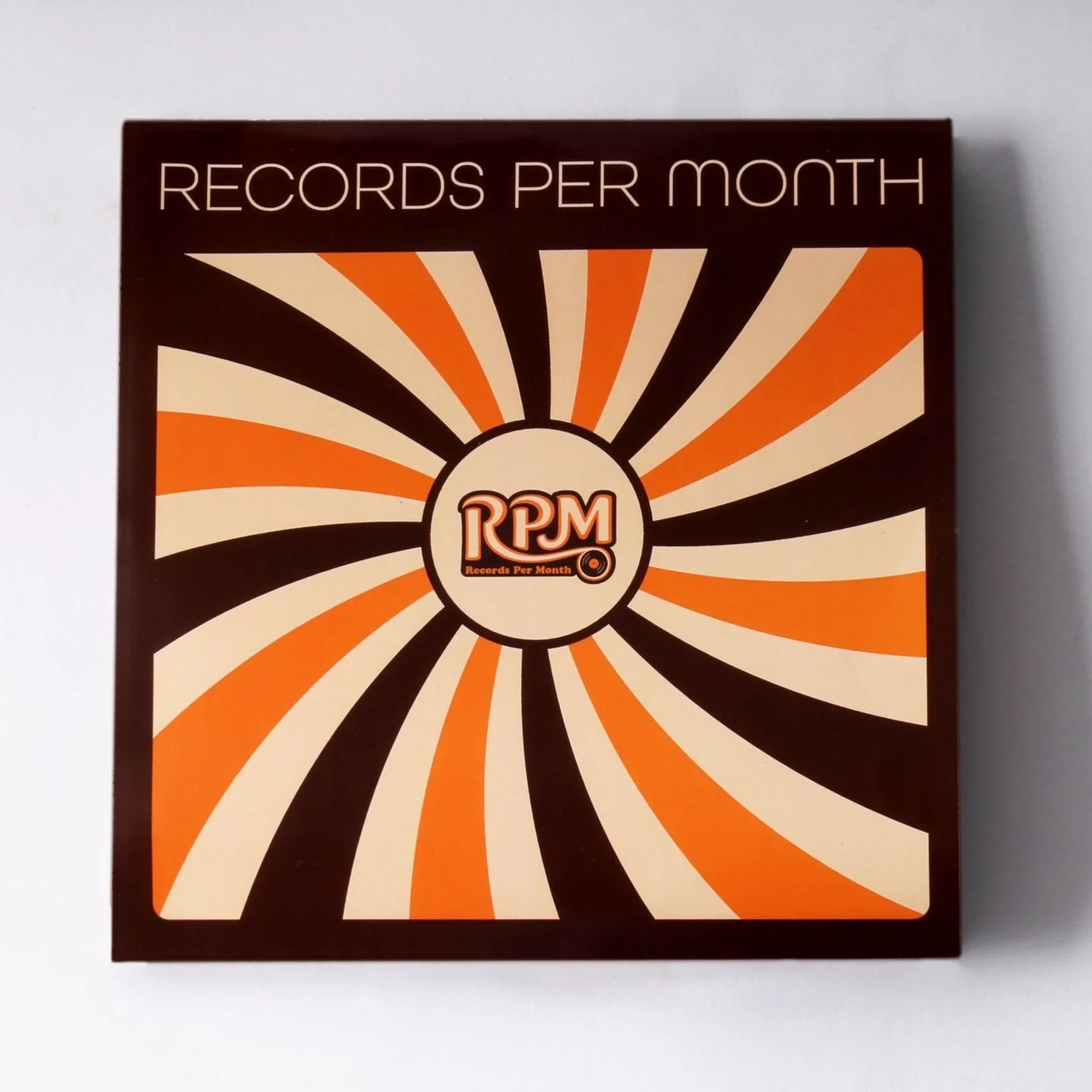
For my packaging, I had already established the style that I was going for, so I had to figure out how I wanted to apply that to my boxes. I tried blending a lot of the patterns I saw from the disco style with vinyl record elements to see what worked. I ended up with a lot of iterations, but I decided to mainly pursue the sunburst record and the spiral pattern record covers for the boxes. For the base subscription of the box, I kept the same color scheme as my logo to keep consistency for my brand. In the early versions of my premium packaging, I added a magenta color to the normal color scheme to help further differentiate it from the base subscription. Towards the later stages of my project, I developed the idea that my logo could work in a variety of colors, similar to logos like MTV, so I applied this idea to a new color scheme for the premium packaging. I felt that my original idea for colors for the deluxe packaging did not make it feel premium enough, so I decided to go for more of a black and gold color scheme. It was also during this time that I decided to resize my box so that it would be a tighter fit on the record inside.
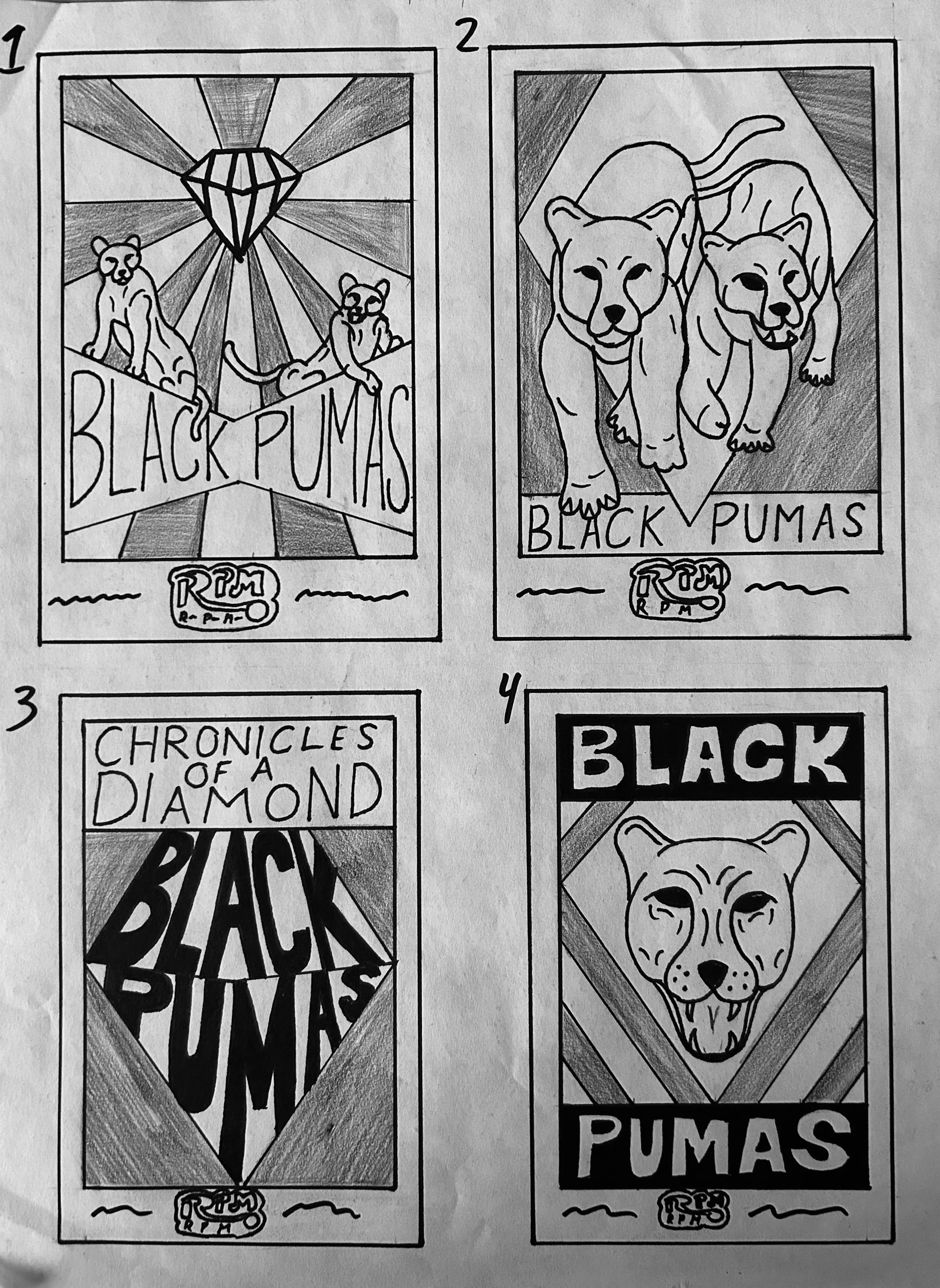
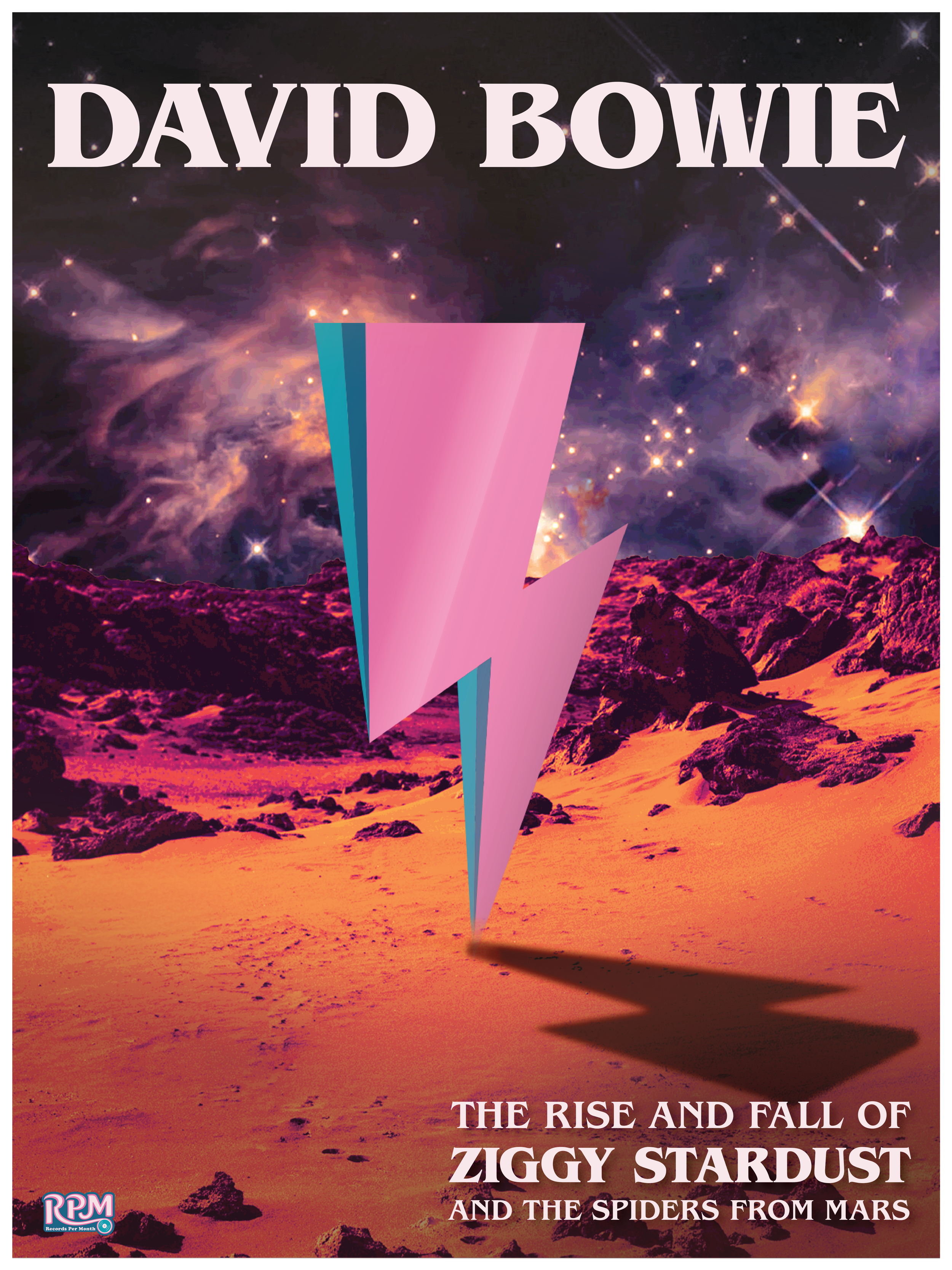
Posters:
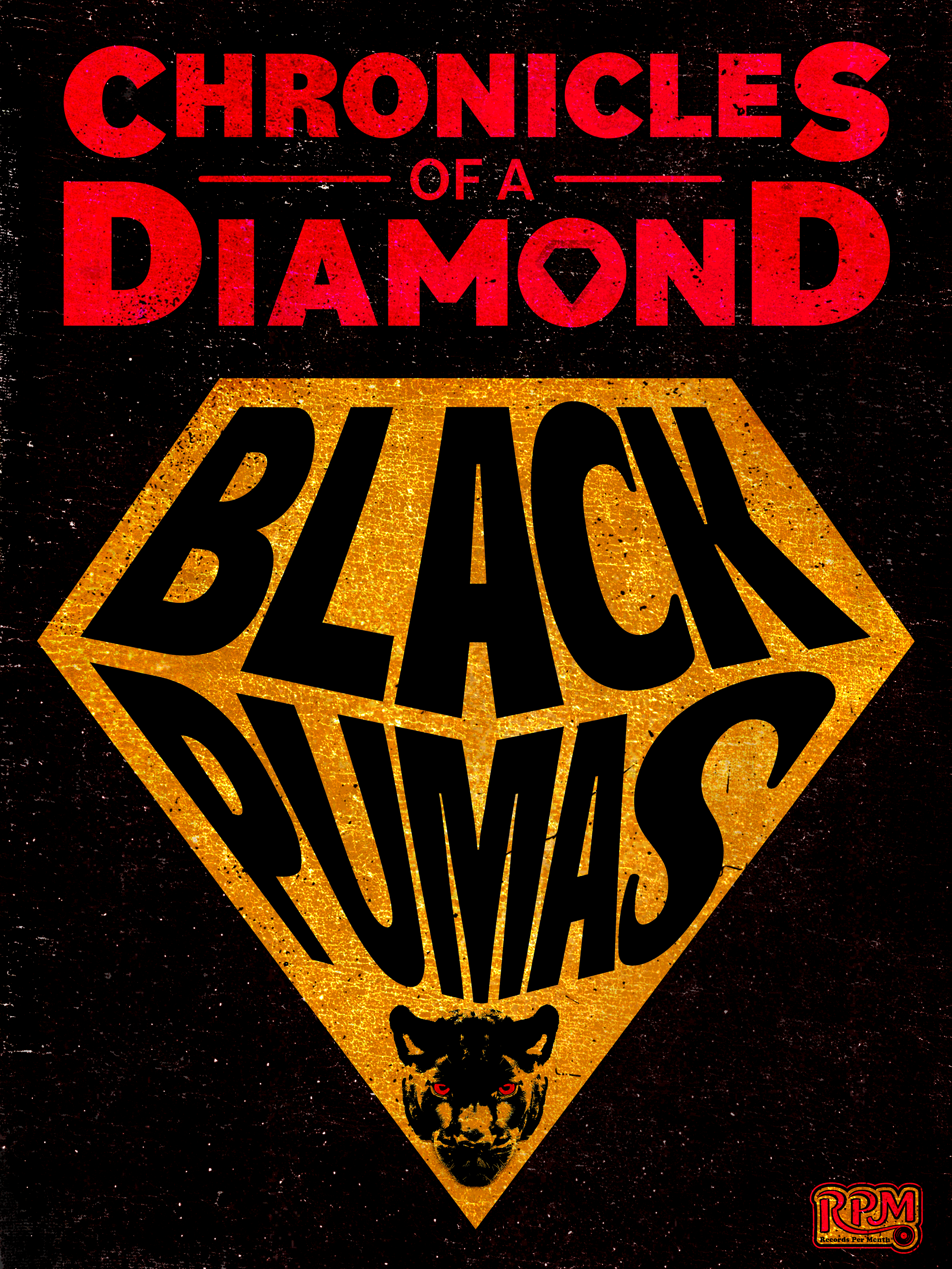
The process for developing my posters went through several changes for each. Most posters began with research and thumbnails which I would then choose which one I felt was most successful and keep developing it digitally. The early version of my digital posters had more of an association with my brand but as the process went on, I found that the audience that would be receiving these posters would not want to display it for my company, but instead display it for the bands themselves. For that reason, I pulled back on how many branding elements I was using until I was left with just the logo that matched the color scheme of my posters rather than the entire brand. I also decided along with this that it would be best to increase the size of the posters from 11x17 to 18x24 to make them feel like more impactful posters.

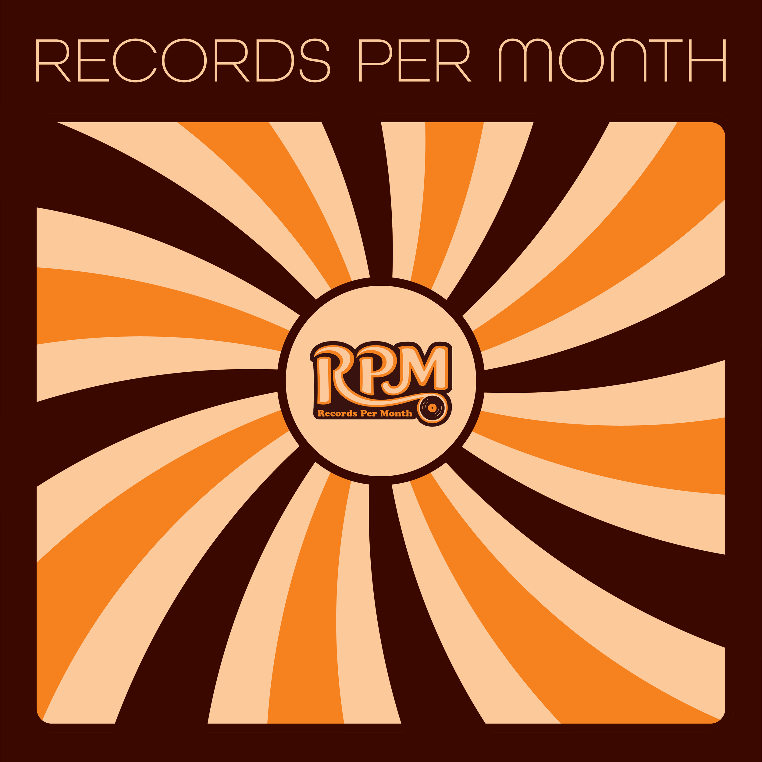
Back Cover
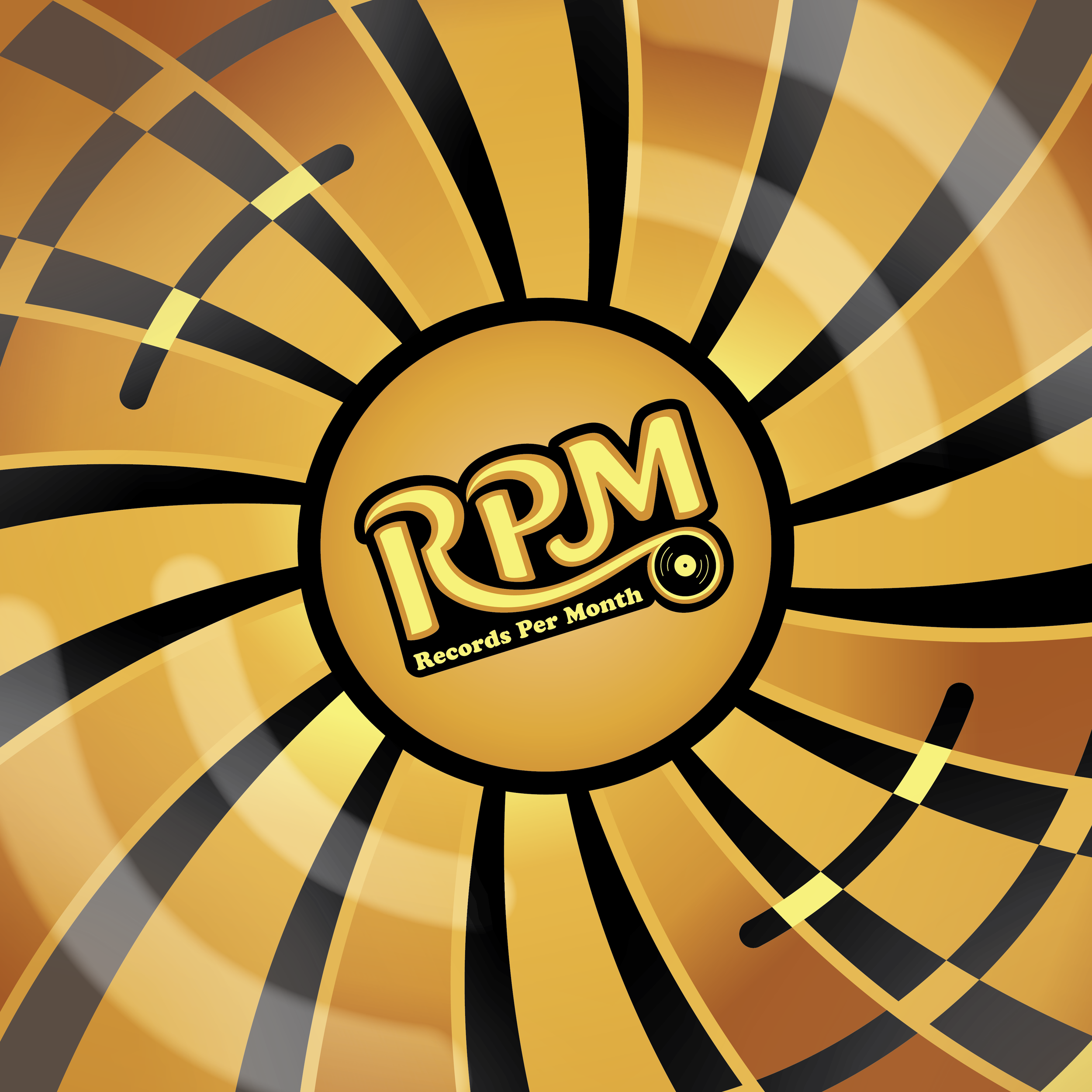
Front of Disc

Final Product
Logo

Packaging

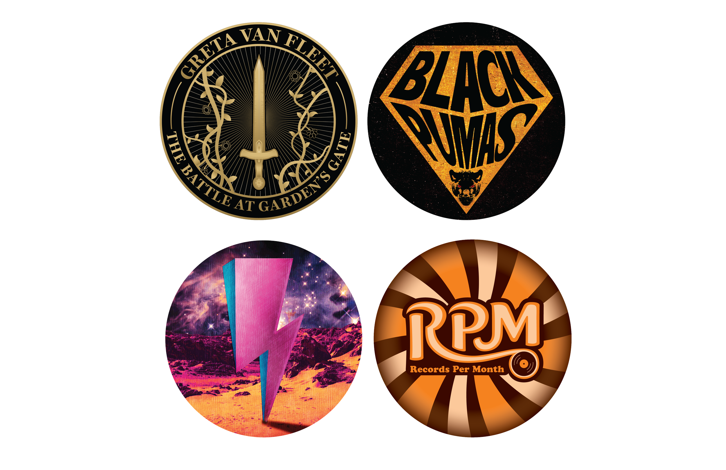
Stickers and Pins

Vinyl Slipmat
Direct Mail
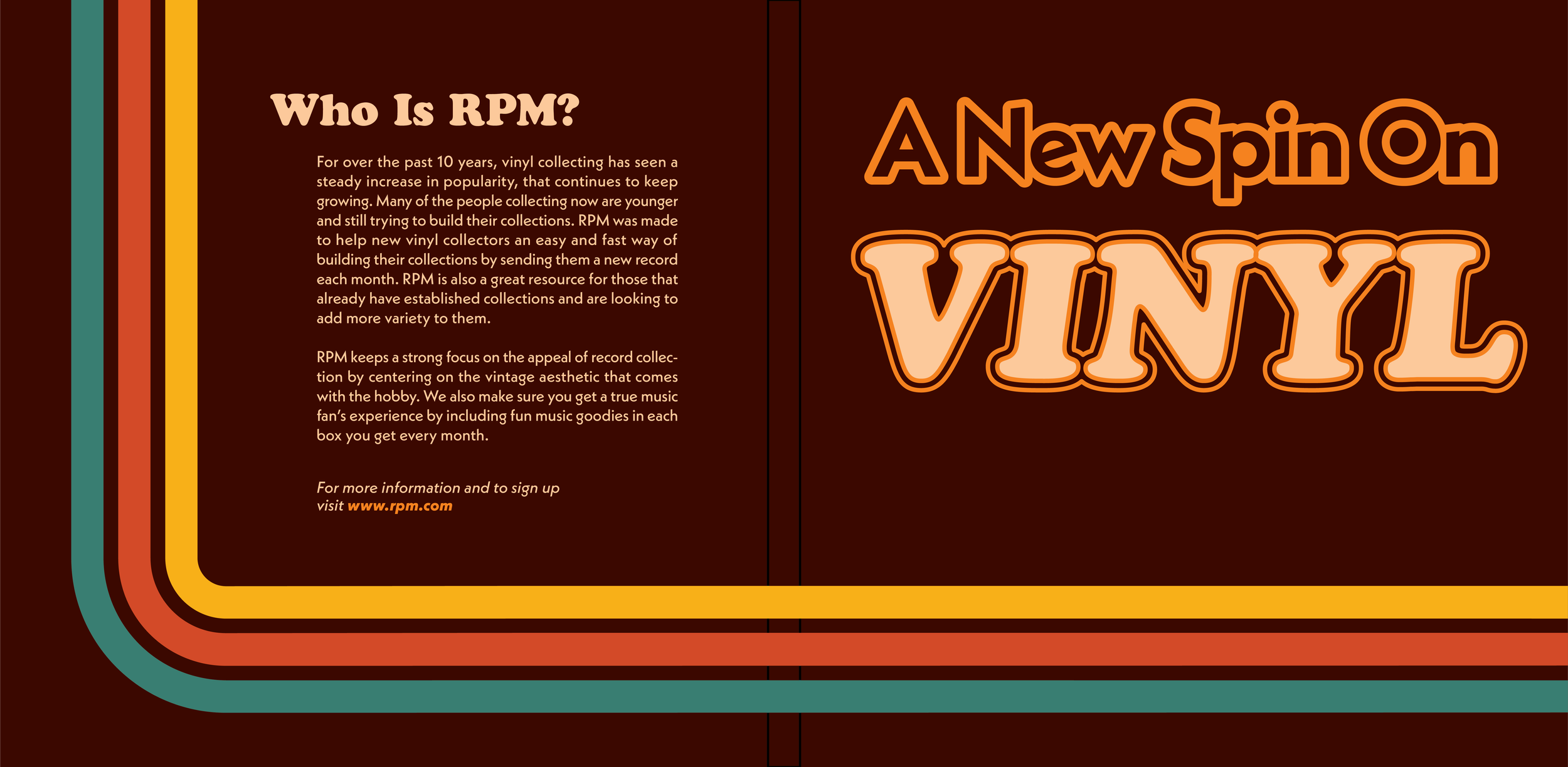
Front Cover
Inside Spread
Back of Disc
Posters
Website