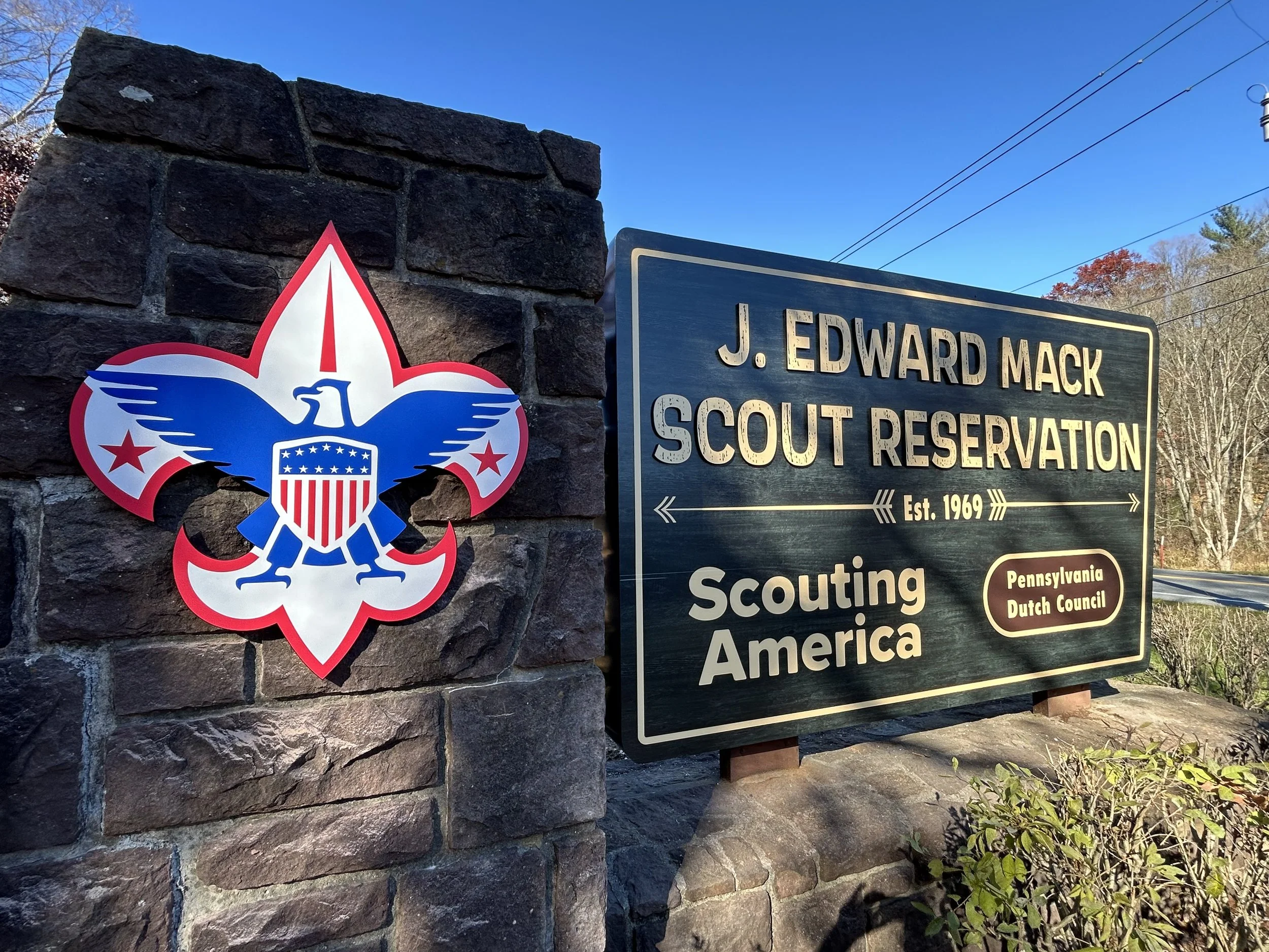
Camp Mack Entrance Sign
Deliverables:
1 Entrance Sign
1 Dimensional Boy Scout Logo
This was my first professional project at Stoner Graphix and the first monument sign I designed. This allowed me to see how bold I could go and how far I could push the design. The monument sign would be using an existing stone structure as the base and I was able to make the sign 10’W x 6’H. I knew that I did not want to make something boring and just keep everything contained in a rectangle and I chose to give the structure a fairly unique shape. I gave everything a woodland aesthetic with natural colors of green and brown, stone and wood textures, and expressive typefaces that felt friendly but fitting for the camp.
Process
I started with some early ideas that incorporated a wooden stump as the back piece for the main sign that included all the text for the sign. I tried various types during this phase with a lot of them feeling very rough and rustic, and some being more friendly with script faces. In one version I even pushed for an almost postcard-like aesthetic with an illustrated scene and expressive type. Later versions removed the wooden stump background for a more simple shape. I also combined and expanded upon some versions like removing the stone background in favor of the green wooden background. This phase landed the client on the design they liked the best but still required small changes before final production.

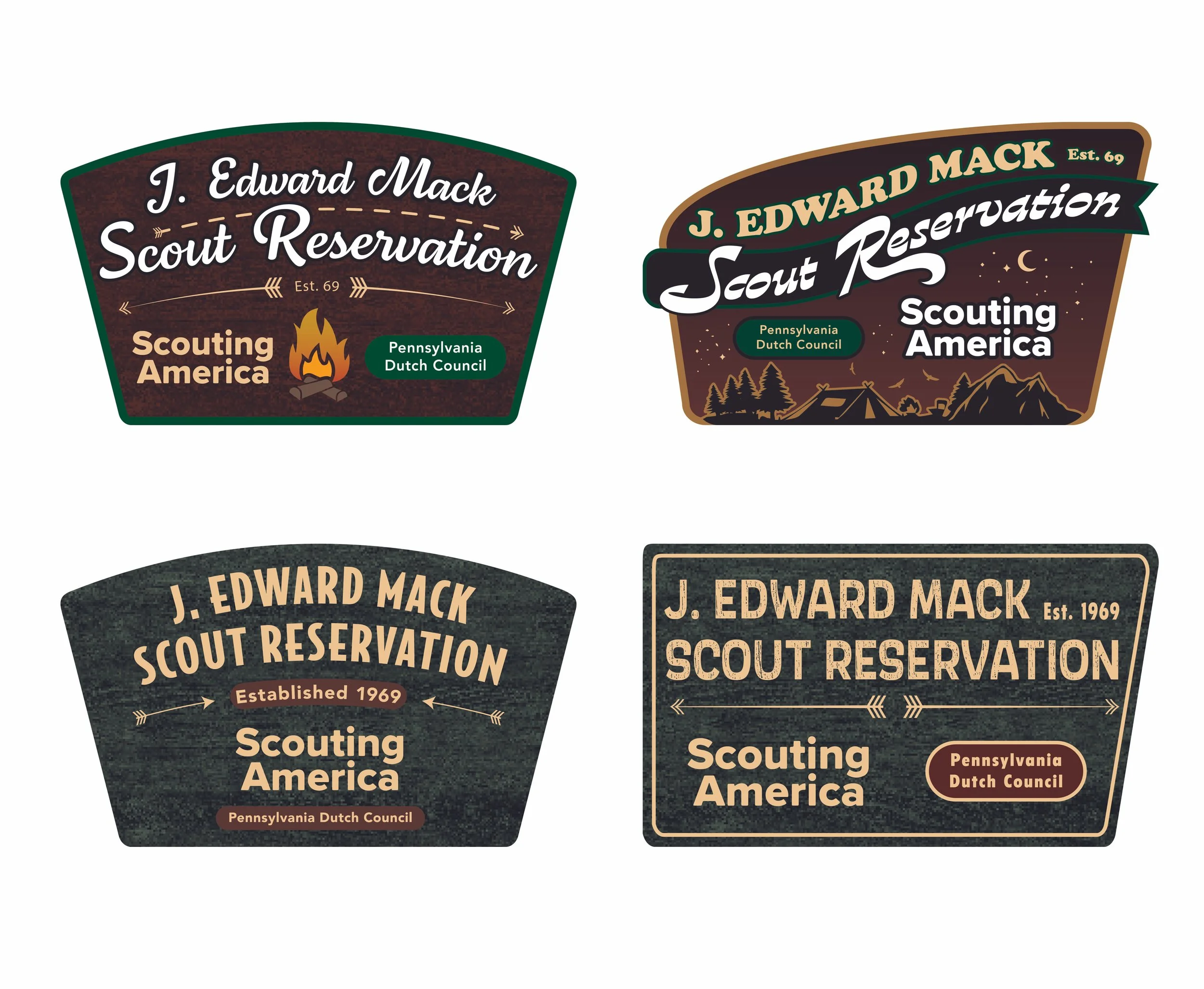
Final Designs