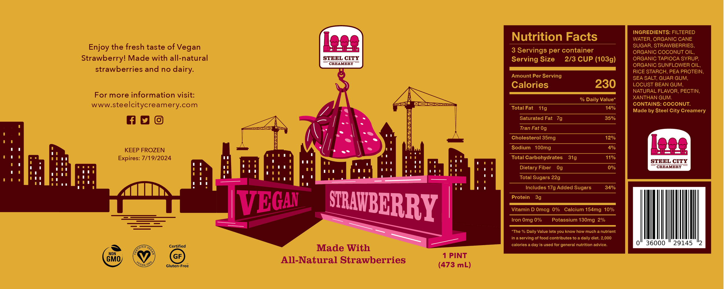
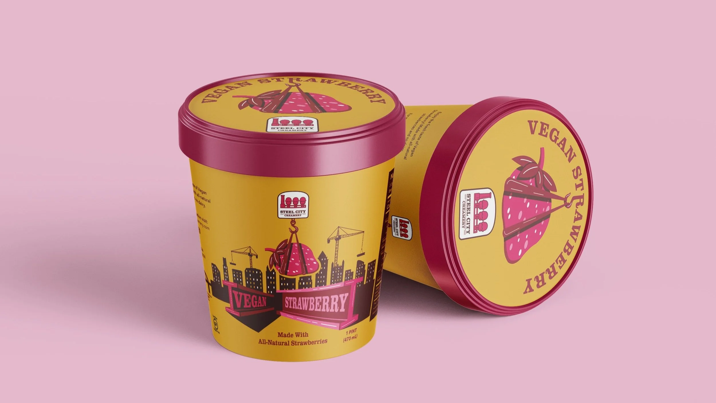
Steel City Creamery Ice Cream
Deliverables:
1x Logo
1x Ice Cream Pint
This project focused on rebranding the Pittsburgh based company, Steel City Creamery. Since the company was based in Pittsburgh, I took a lot of inspiration from common Pittsburgh imagery. I mainly chose to focus on the steel factory aspect of the city, which can be seen in the logo, as well as the steel beams and cranes showcased on the container. I also used yellow as one of the main colors because it is synonymous with Pittsburgh.