Burnt Hill Taxidermy
Deliverables:
1 Logo
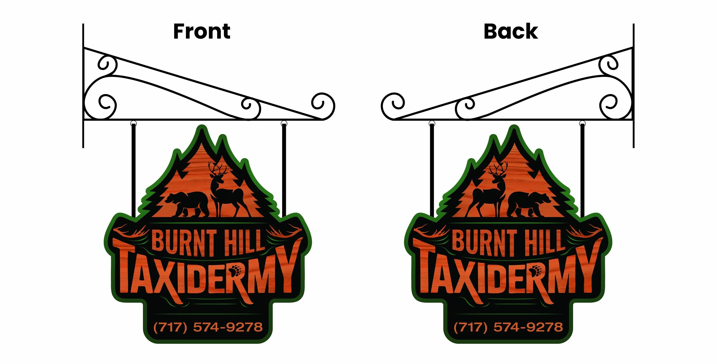
1 Hanging Sign
This was my first professional logo project at Stoner Graphix. Burnt Hill Taxidermy had not had a logo yet so they originally only had vague ideas of what they were looking for. They sent us some reference photos that I used as a basis for finding a starting place and seeing how far I could push past that to deliver something very exciting.
Process
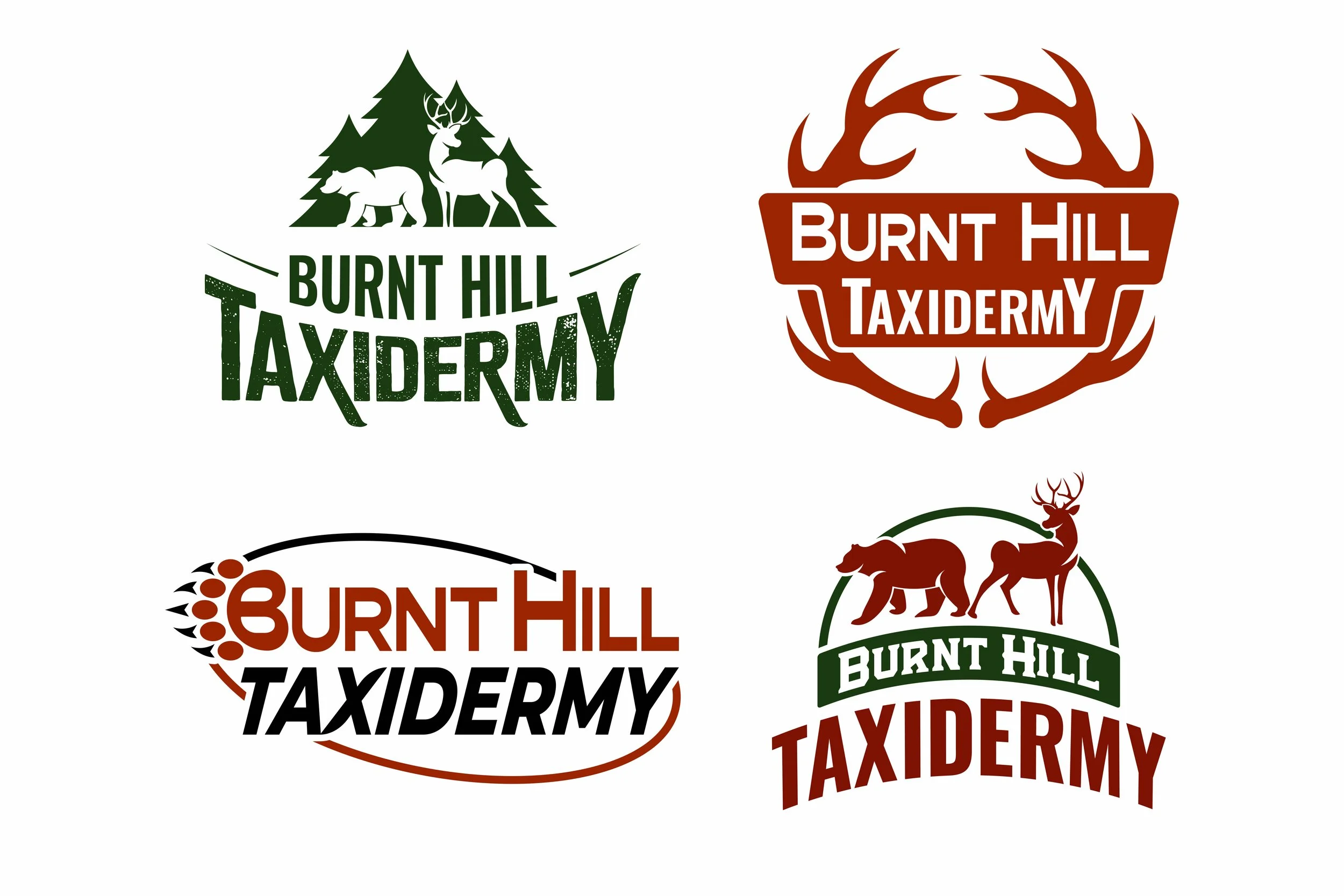
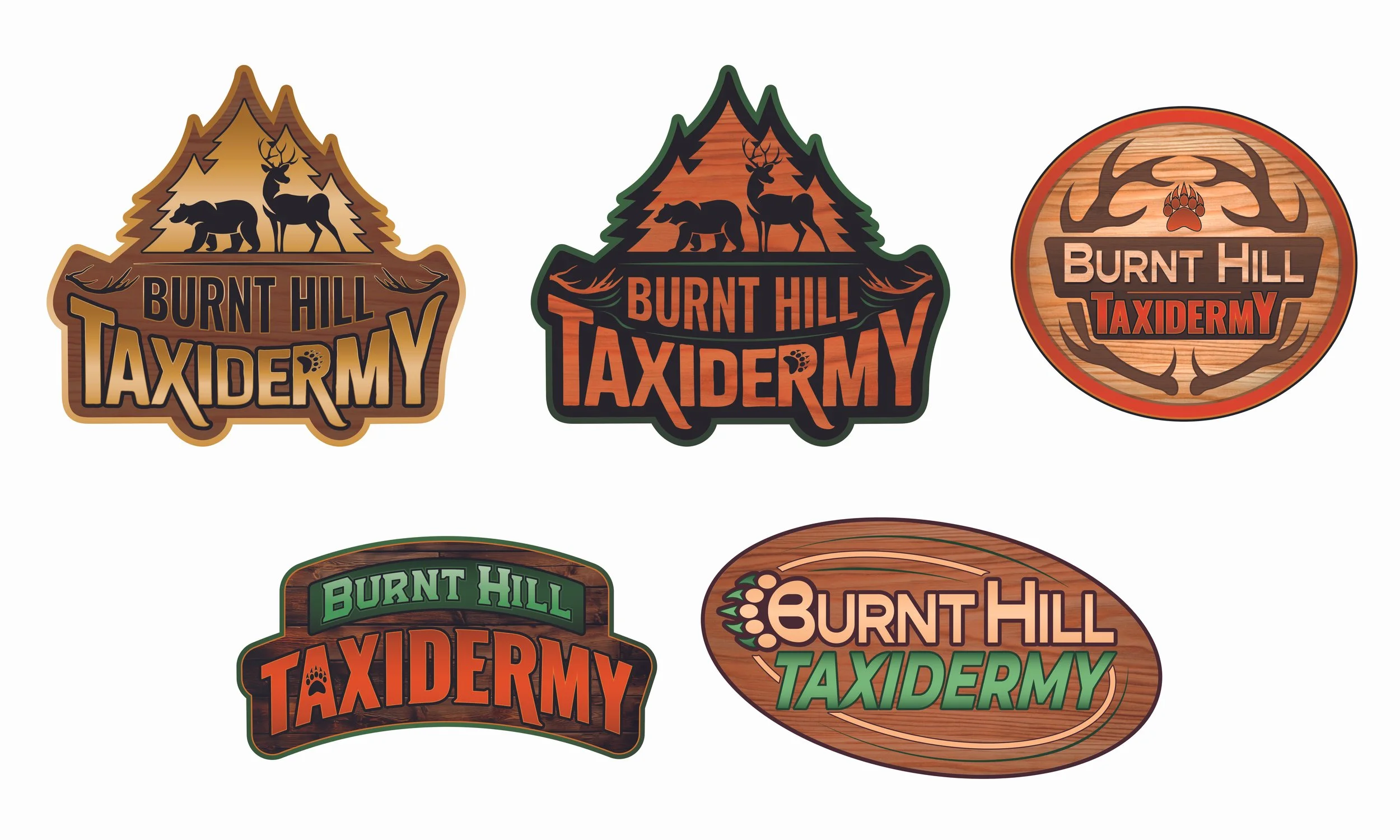
I originally started with quick sketches that moved to early digital thumbnails that I showed my art director. During this stage, I pushed for simplified and modern logos that used closure, stylized figures, and custom type. I also aimed for a more naturalistic color palette of dark forest greens and burnt oranges as I believed this made a lot of sense for a taxidermy company that mostly deals in woodland animals. When I presented these logos to my art director, he pushed me to include more features and add more textures and materials to make the logo feel more unique. Since this was my first logo at Stoner Graphix, I was advised to pull references from some of the company’s previous work and use that to help broaden my color palette a little more too. The result was the logo comps that we sent off to the color. They initially really liked the tree and animal silhouette logo and the bear claw in the B logo. But through further processing, they finally landed on a tree silhouette logo with a green, orange, and black color scheme.
After the logo was decided, I then had to process that logo into a hanging sign that included the company’s phone number. This proved to be a slight challenge as the sign was going to be double-sided and I had not made a symmetrical logo with a simple outside shape. I ended up having to rework the logo (with the client’s approval) so that the flipped side would have a reversed image of the trees and animals and a flipped outside shape that would allow for the image to work on both sides. The final outcome was one that both the client and I were very happy and proud of.
Final Designs